PUBLIX
A couple of packaging illustrations for the Publix Black Dot products for kids. A set of dinosaur/fruit/gummy hybrid characters as well as a mouthwash bubble fellow. The ask was a BoneHaus style of clean, attractive, fun characters that would work at scale as well as having high visibility from afar.
These are now on the shelves across the 1,200+ Publix Super Markets as well as their online grocery ordering service.
Packaging
Character design for a new sub-label by Publix Grocery.
CLIENT
Publix Markets
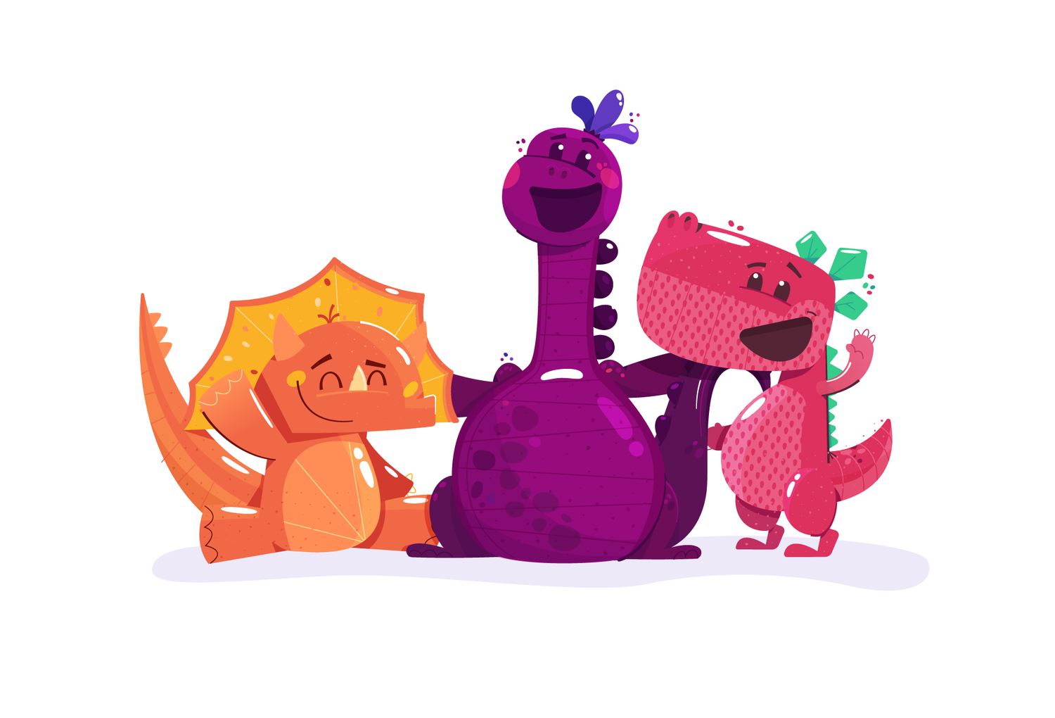
Fusing fruit, gummy, and dinos all together was a balance worth striking.


Most of the challenge to this project was in creating something unique that stood out as unique for the Publix brand while coming in a small impactful size.
These characters are the first of many for the new kids’ label, so it was important to create a strong foundation that they could expand on down the road.


Got a Project?
