In Good company
Branded Illustration System
20+ animated illustrations and a fully modular system of components to be used by MassMutual’s internal design team.
MassMutual’s sub brand, In Good Company wanted to expand their branding into illustration with a dedicated approach.
We created a strong core illustration language and a scalable modular system for their in-house design team to use. The work is being used for small mobile social media posts to full scale billboards and advertisements.
CLIENT
MassMutual
ADDITIONAL ANIMATION
Latham Arnott

In a world full of sterile, cold, financial companies, there’s plenty to be said about some empathy and human emotion.
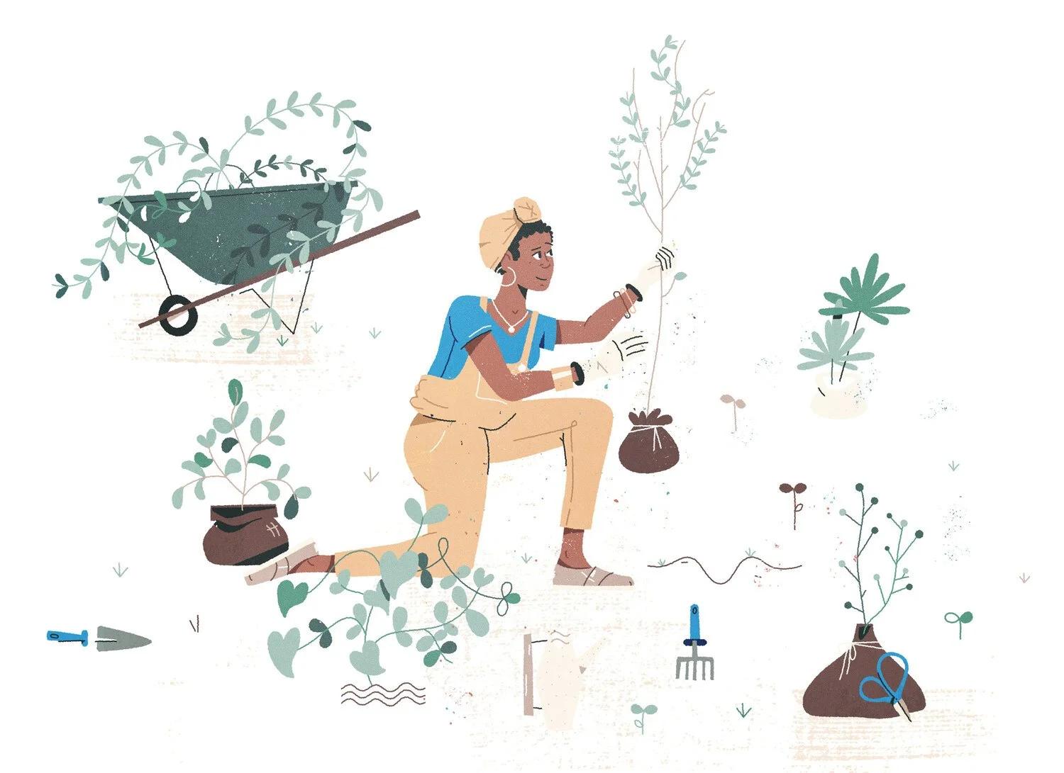


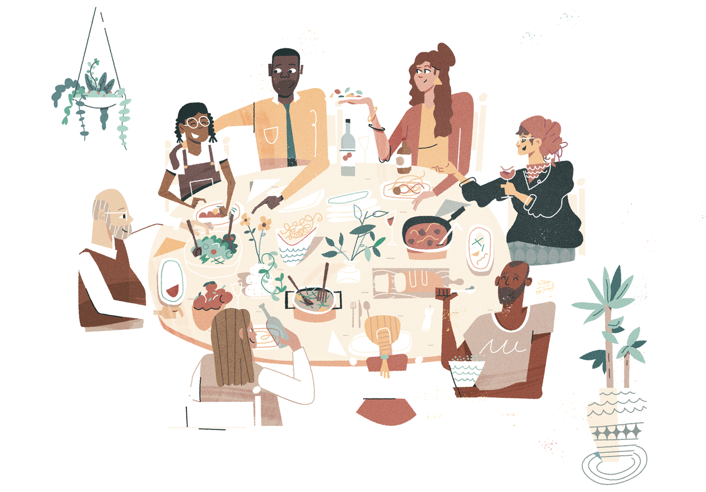
The Challenge
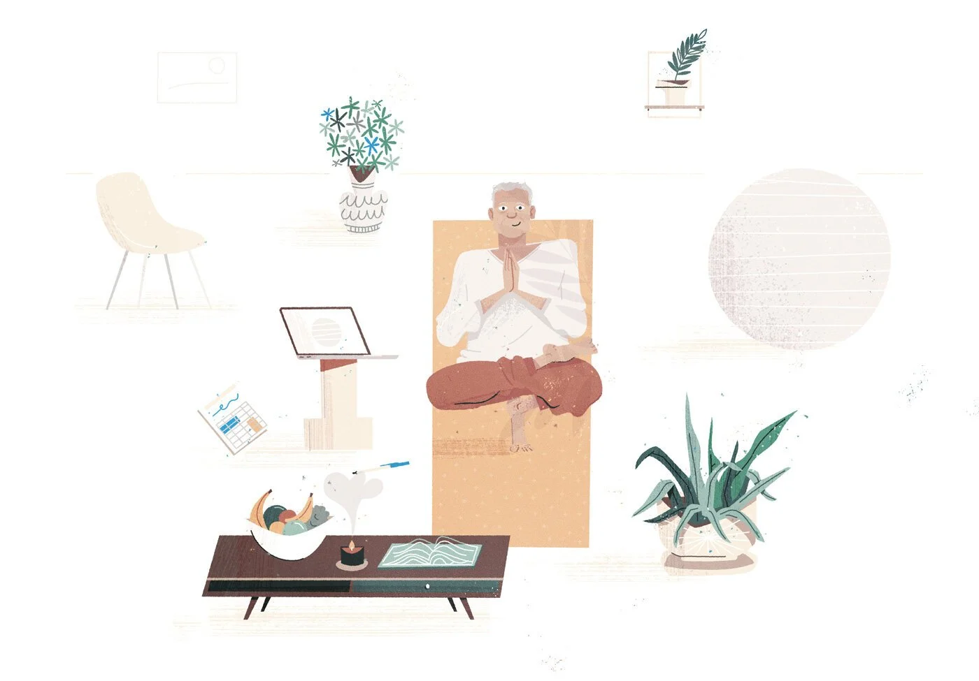
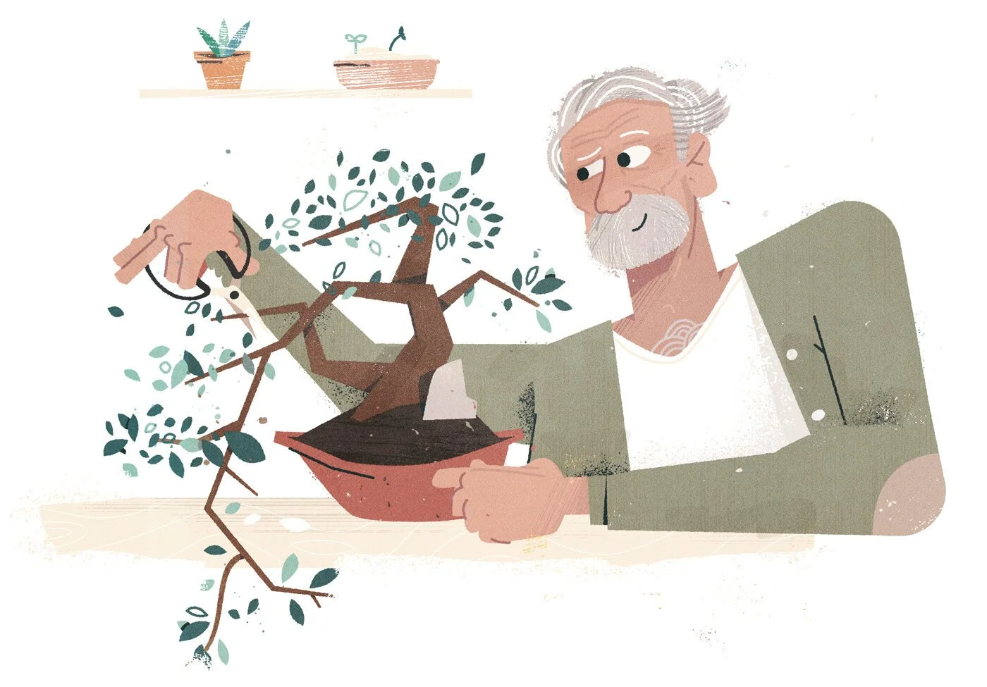
Use touchable, warm, mature illustrations to connect with users on an emotional level.
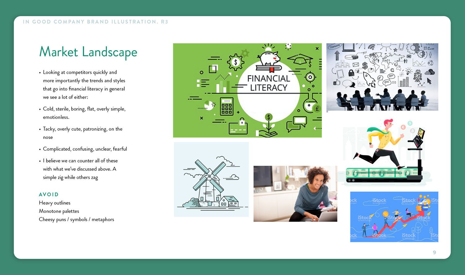
Our goal was to celebrate humans’ individual, unique, realistic financial goals and paths. Beyond typical imagery of piggy banks and charts, we wanted to emit empathy for anyone trying to educate themselves on finance.


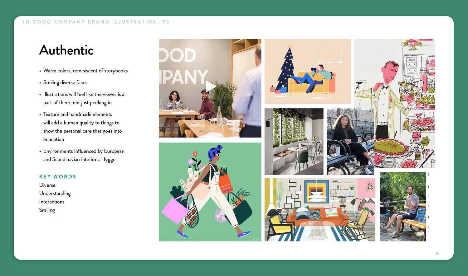
We developed these three core pillars as bumpers on the brand as we explored the visual style.
Aligning each of the brand pillars with a few visual motifs, themes, feelings, etc allows us to stay consistent and tell the story that most uniquely describes the client’s.
Limiting the visual input and inspiration in the grand scheme of things allows us to move forward quickly.
We built the illustration style off the branding that In Good Company (IGC) had established over the years. As they’ve evolved and found their footing, it’s become more and more apparent what their illustration would look like. Here are some snippets from the deck.
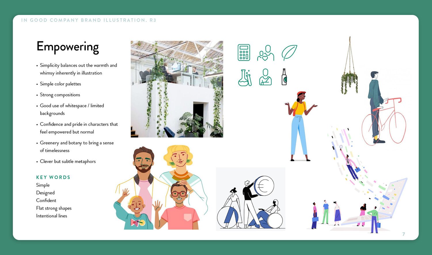
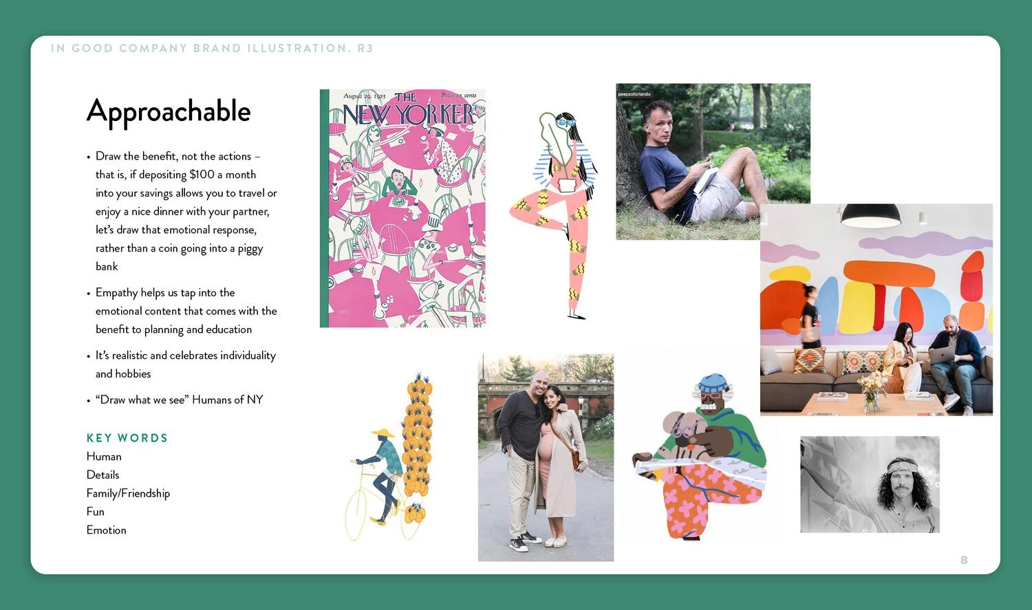
Pillars
System Development
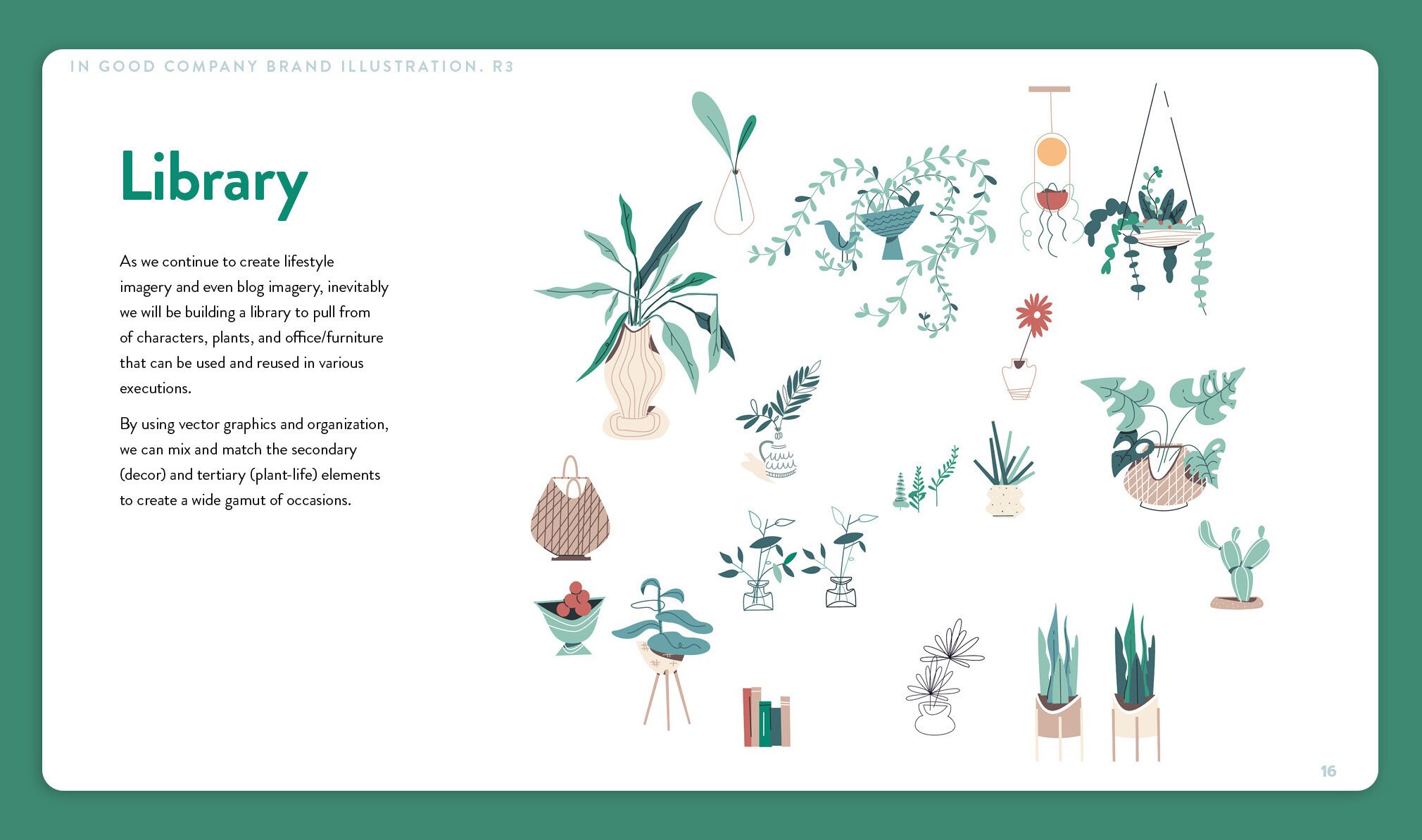
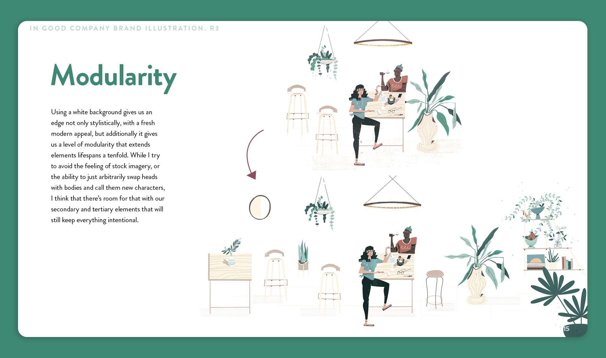
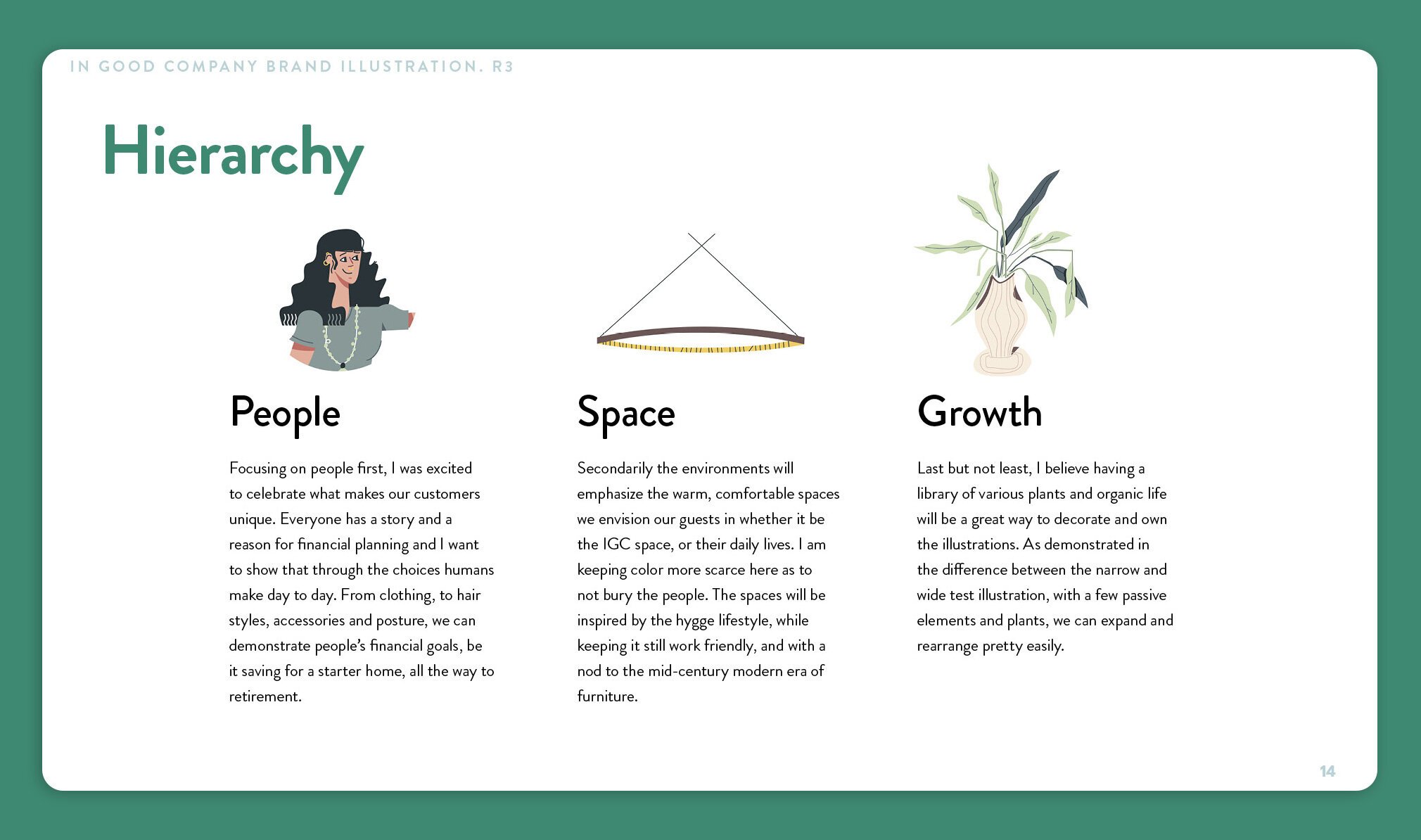
With the potential of multiple people working on the brand at once, creating a system was important to help illustrators (or even myself) keep everything looking and feeling consistent. By focusing on the hierarchy of people, then space, then plant life, we had guidelines that answered a lot of questions when beginning a new visual.
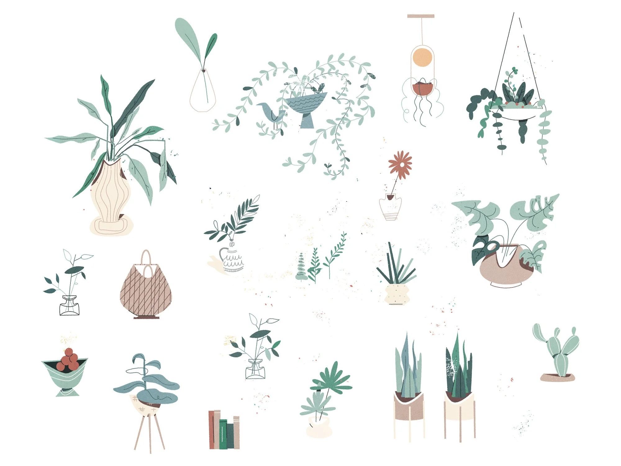
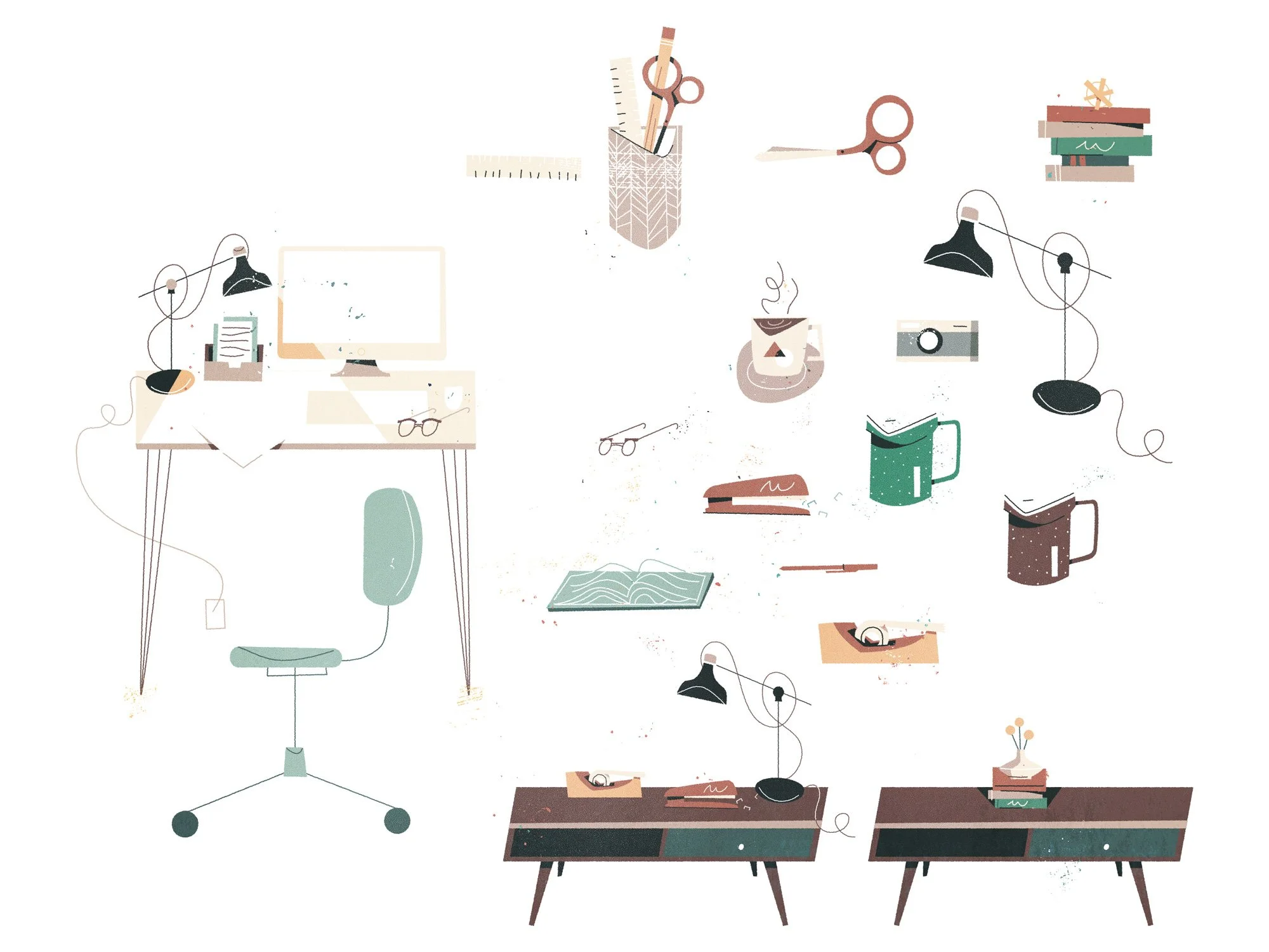
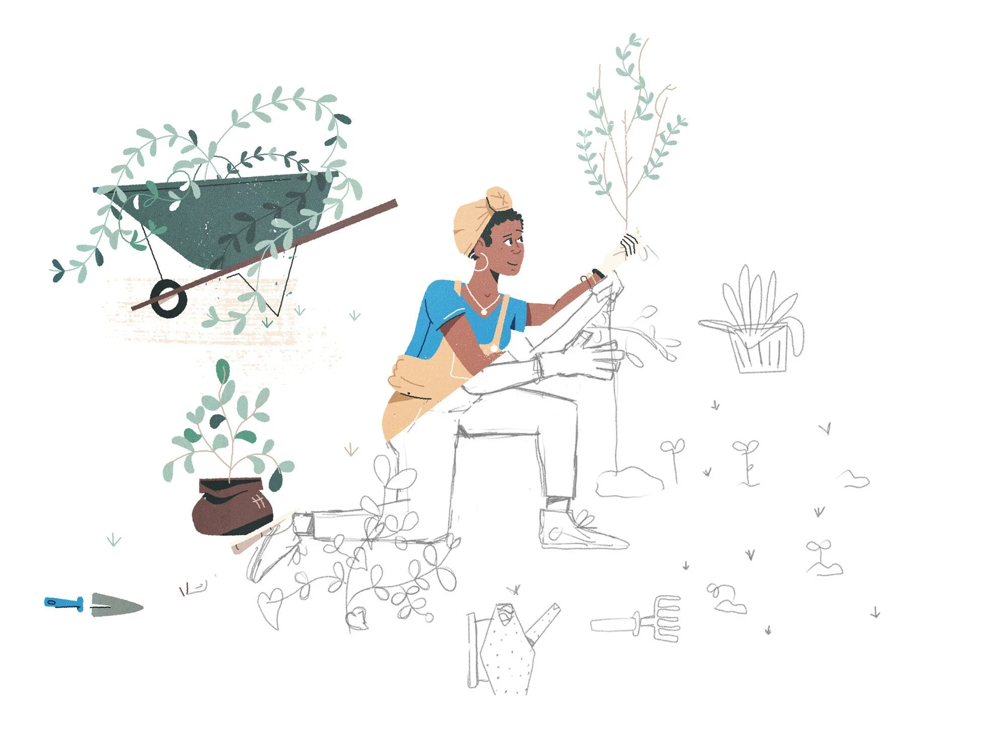
Process & Sketches
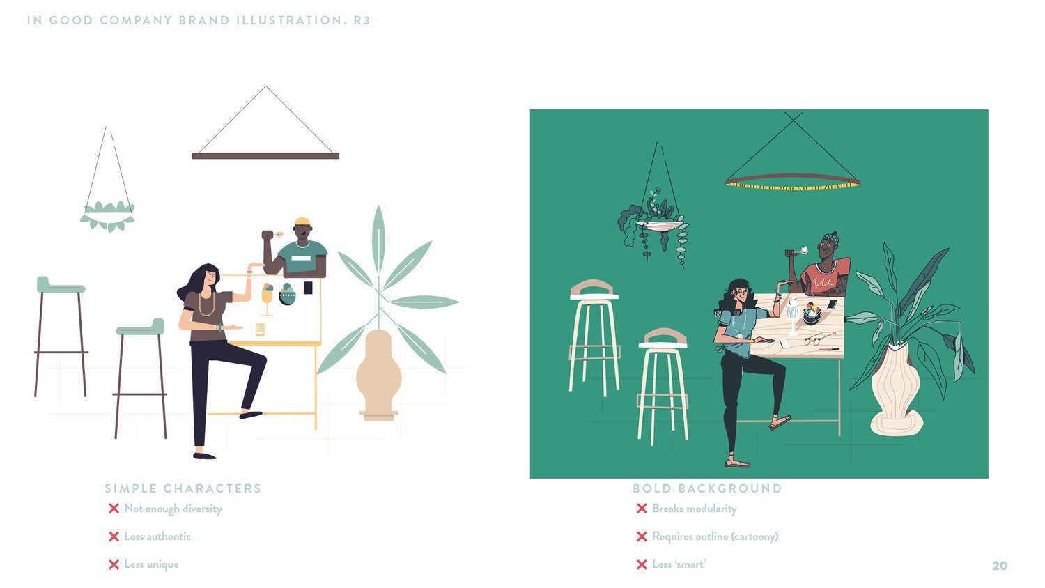
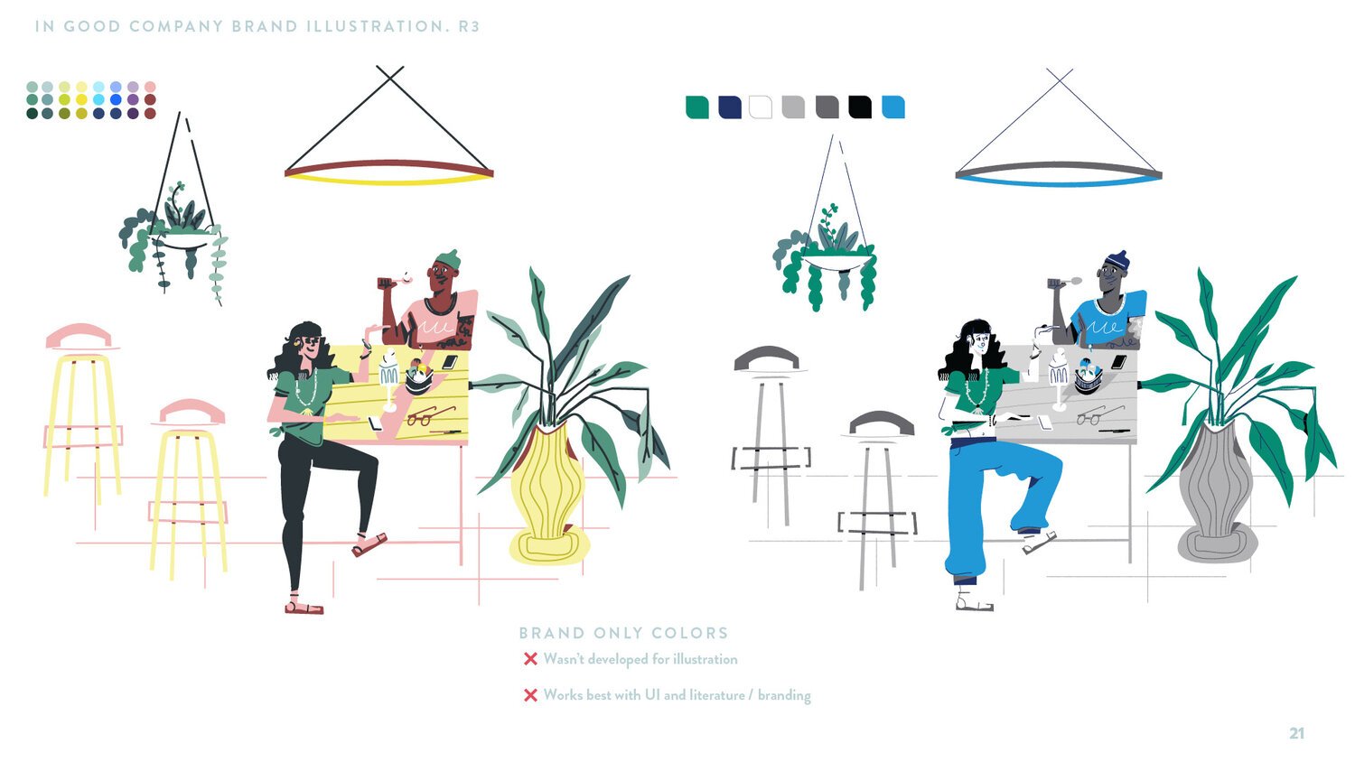
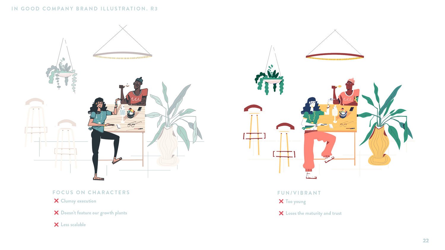
We worked on a few variations, trying palettes that were strictly on brand, forms and shapes that were simpler.
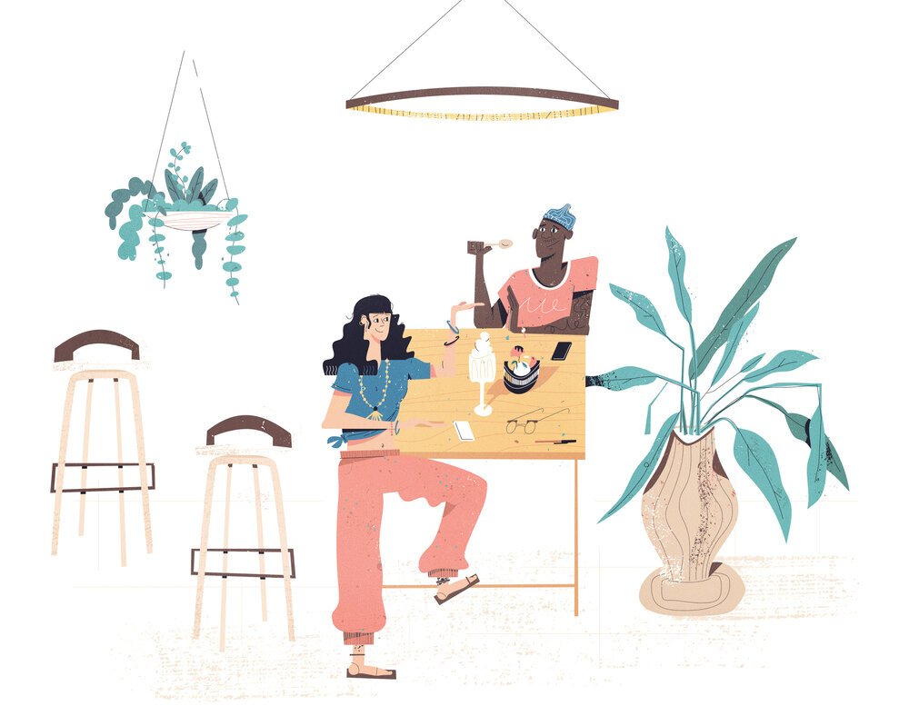
In the end, we decided a more detailed and textured approach borrowed from storybooks would best connect with a sophisticated and younger audience.
Got a Project?
