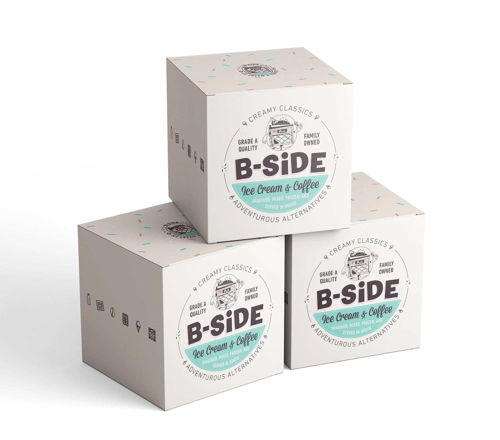
B-Side Creamery
Branding & Packaging
Alternative Creamery Branding & Mascot
This project is a true culmination of all the things I enjoy about my unique positioning in the illustration world. When the client came through looking to open an Ice Cream shop that focuses on a Starbucks vibe, with no pressure or stress of the intensity that many creameries force you to endure, I was completely sold on the experience.
The process was a great mix of higher level strategy and positioning, down to the nitty gritty of drawing, character design, physical packaging execution, etc.
CLIENT
B-Side

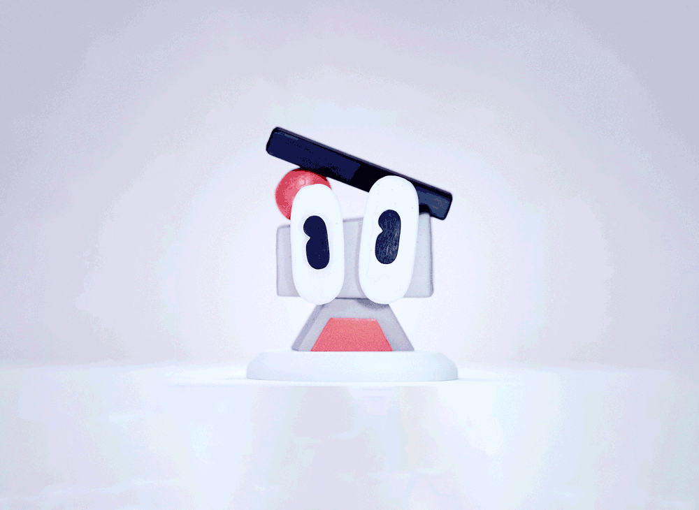
Character
B-Side Ice Cream is about mixing flavors and serving unique experiences to each customer, diverse as can be. Referencing some golden era mascots, and considering the dairy for the ice cream comes in a milk crate, multiplied by the idea of serving up alternative flavors, or records, we came to a milk crate character, serving up different flavors of his collection.
Inside the crate holds records of different flavors of ice cream. Each being an LP format. Strawberry Record, Cinnamon Record, etc. The character rummages around and pulls these LP’s (flavors) out and to mixes em up to give the perfect delicious treat to kids and adults alike.


Wordmark
Inspired by alternative record labels and some bounced baseline punk sans serif fonts that ultimately landed us on a very simple but strong wordmark.


Bonus points for the only other product they sell being waffles which we were able to gesture with the crisscross in his belly.


Running a wide gamut of wacky to simple, the trickiest bit here was finding the correct balance of ice cream / food with crate that still felt like it had nods to music and records. The floating soda jerk hat really helped sell push food and beverage.


Got a Project?

MORE WORK
✱
MORE WORK ✱