PAYROLL
Illustrated Brand Identity
A full rebrand of payroll software giant, Wagepoint.
Wagepoint is a payroll software solution for small and medium sized businesses. They wanted to bring their visuals up to speed with their growth over the years.
It was time for them to rethink most touch-points with all of their newfound experience and insight on their customers and strengths.
ADDITIONAL HELP
Glenn Thomas
Dom Civiello
CLIENT
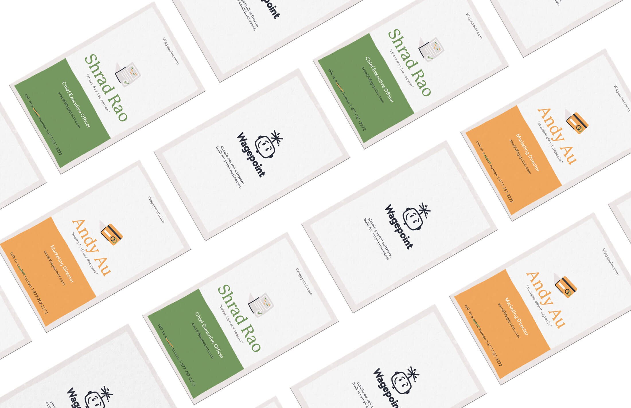
Wagepoint

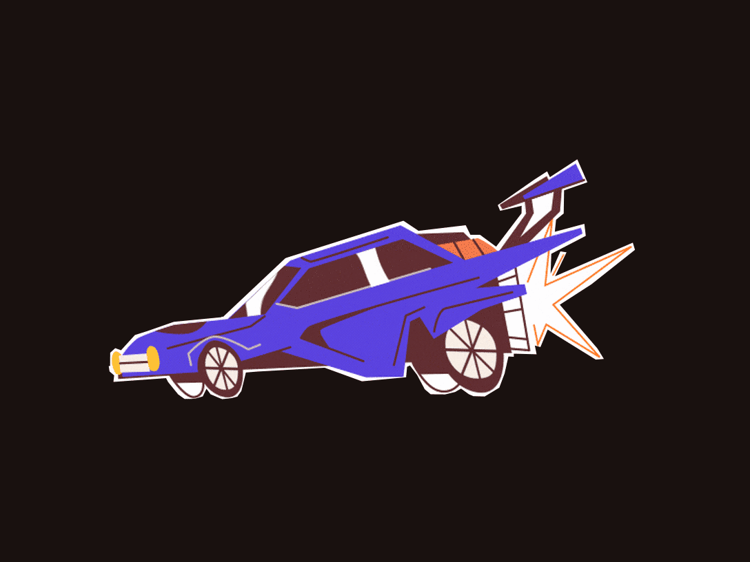
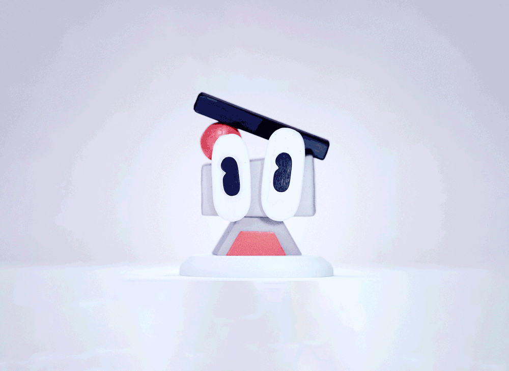
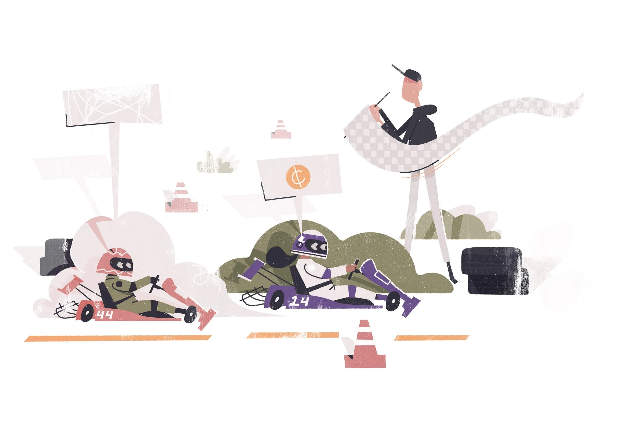
Each Illustration is inspired by the users, to highlight the wide range of people that need to run payroll.
We focused on the emotional benefit that the software brings; the ability to get back to why you started the business to begin with.


Creating the Style
After a full brand audit, we defined three core pillars for the visuals to stand on. Each of these pillars have a visual cue.
The brand’s core pillars are Friendly, Competent, and Educational. They span the full reach of the brand. Each of them have a list of synonyms and related words that help us define what our visuals may look like.


No one started a business to run payroll and worry about taxes.
They started it from that spark of joy of tossing pizza dough with their buddy. Wagepoint gets you back to that spark by taking payroll off your shoulders.
The icons are simplified, distilled versions of the illustration.
We used an alternative color palette that is based off of the illustrations, but brighter, bolder colors that better match with the product interface.

Using all of our elements of form, shape, texture, and color defined from the illustration, we were able to create a very scalable and simple style to show the product's features through interface abstractions.


Photography got a simply treatable style to speed up production when illustration was too time consuming.
Sourcing photos that display working people in their element, feeling proud and happy felt like the perfect compliment to the illustration approach.
Shrad Rao, CEO, Wagepoint
Our brand is consistently known for being the ‘cool’ payroll company. In a sea of boring, we shine bright with our look and attitude to match.

Got a Project?
MORE WORK
✱
MORE WORK ✱