READERLY
Branded Illustration System
Twelve animated illustrations with accompanying visual library.
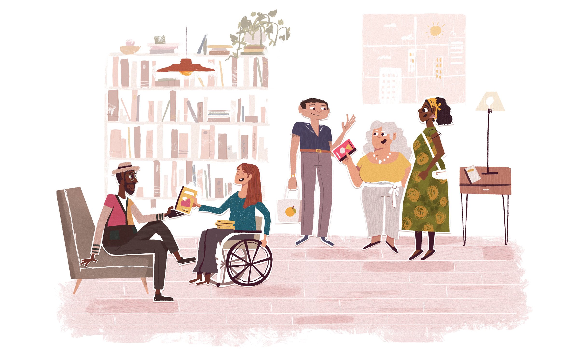
“Book recommendations, Reimagined”. A full suite of illustrations and visual direction for a new type of digital book platform that values authenticity, human input, and a true representation of the worlds leading voices both large, small, and underrepresented.
CLIENT
Readerly
ADDITIONAL HELP
Glenn Thomas
Book recommendations, redefined.
In a world where robots and advertising revenue dictate what books we see, how can we get back to the warmth of a trusted loved one sharing a book they enjoyed with us.


Pillars
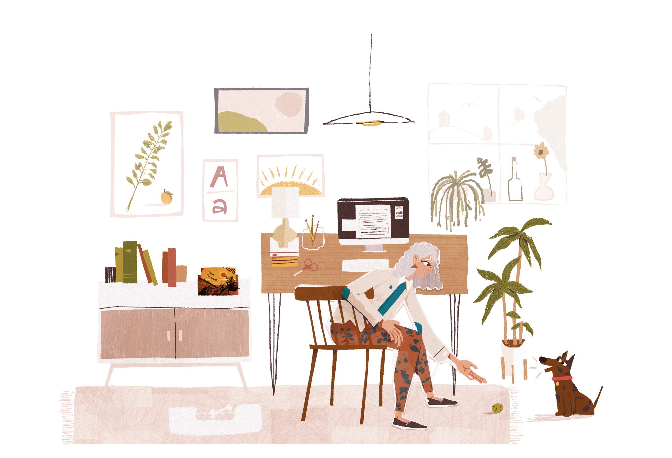
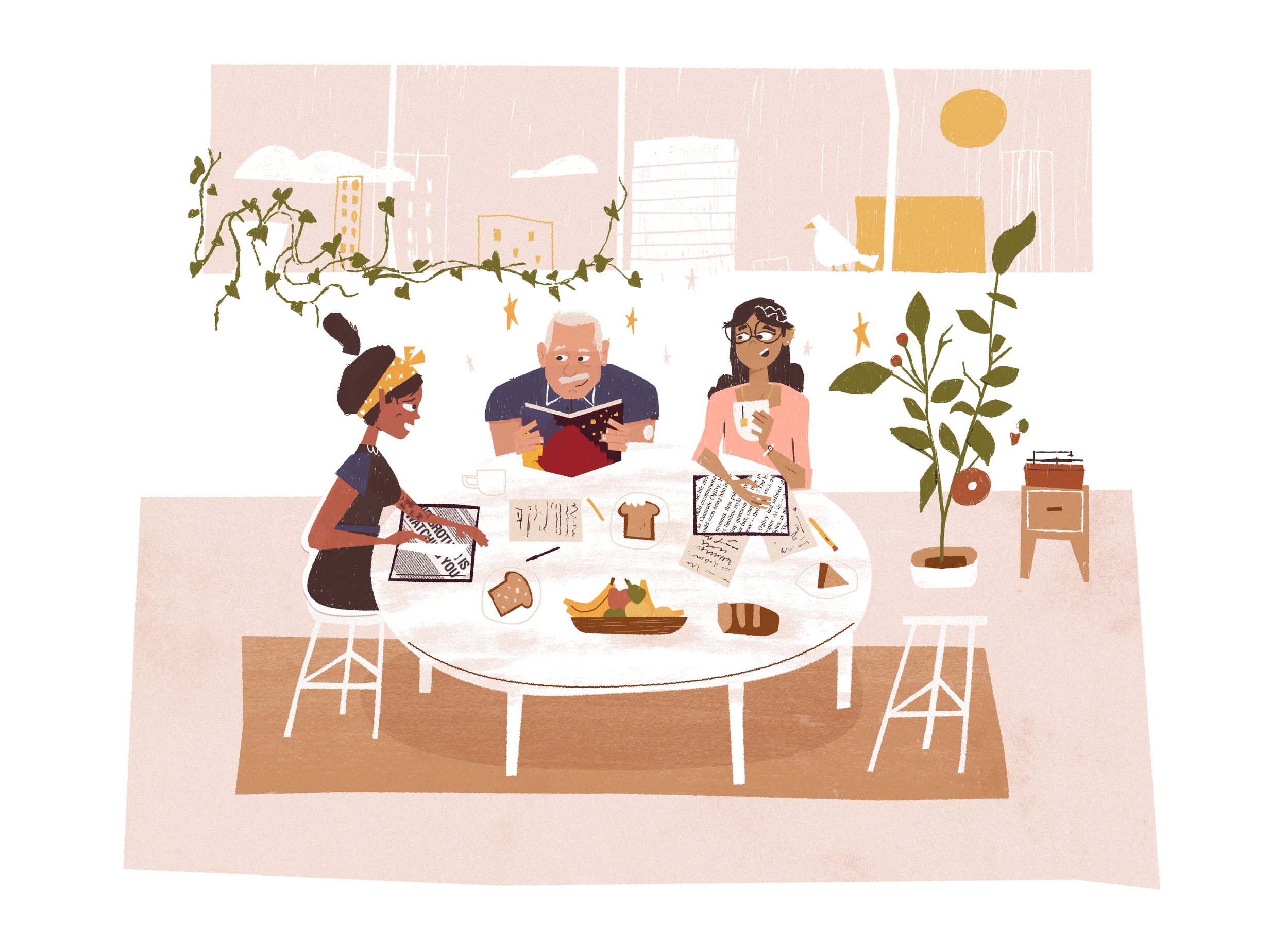
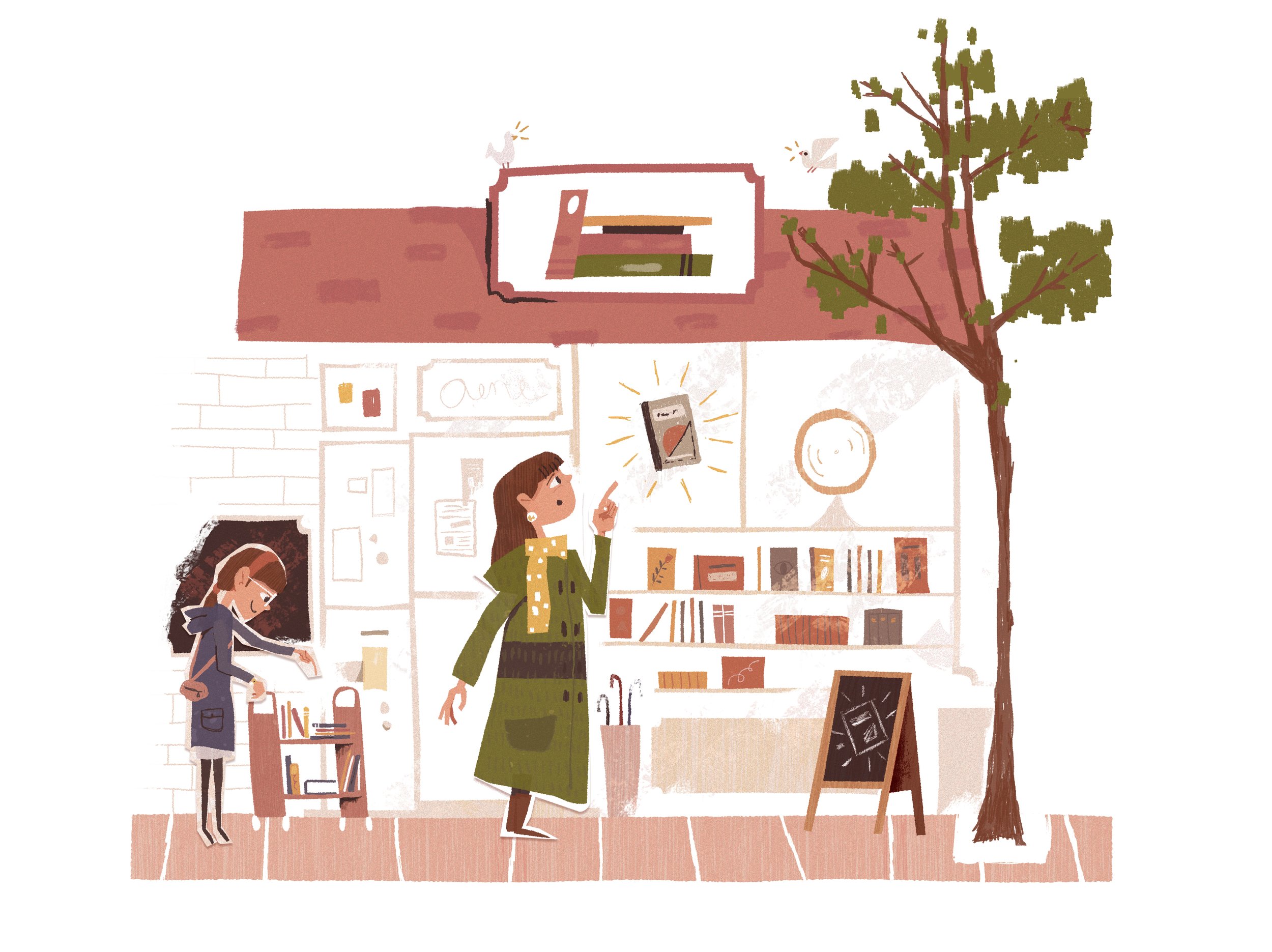
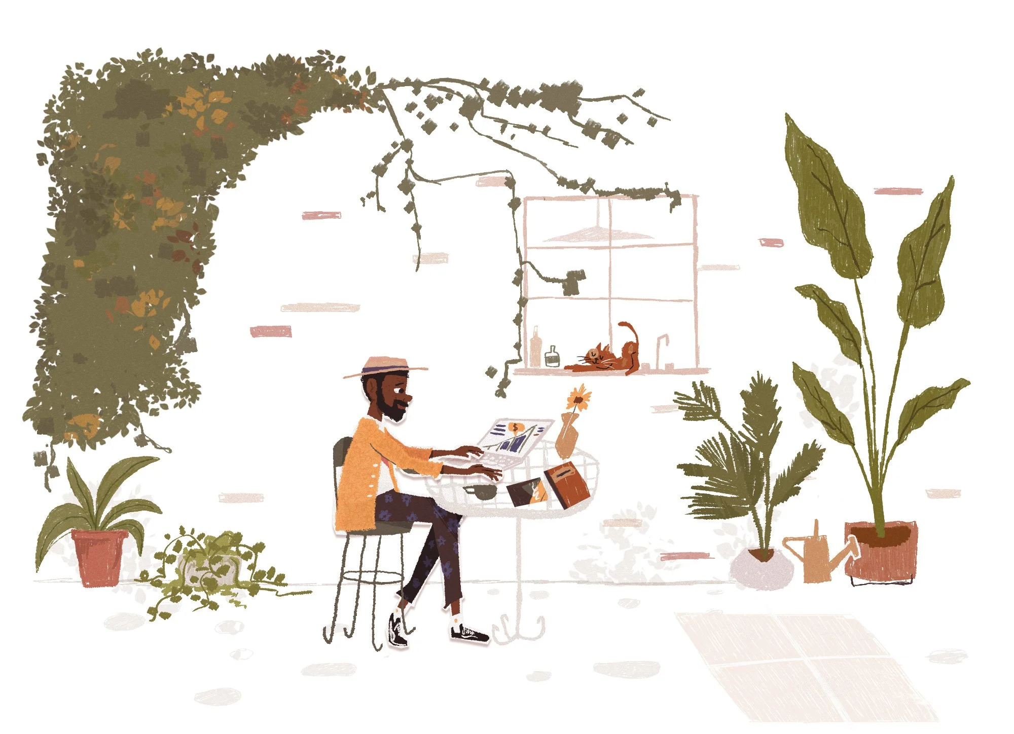
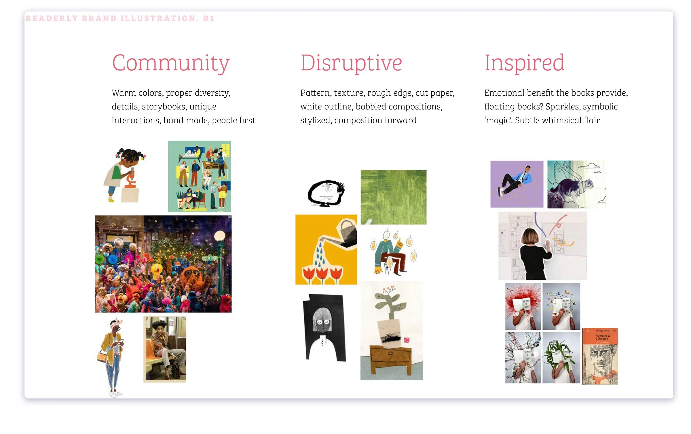
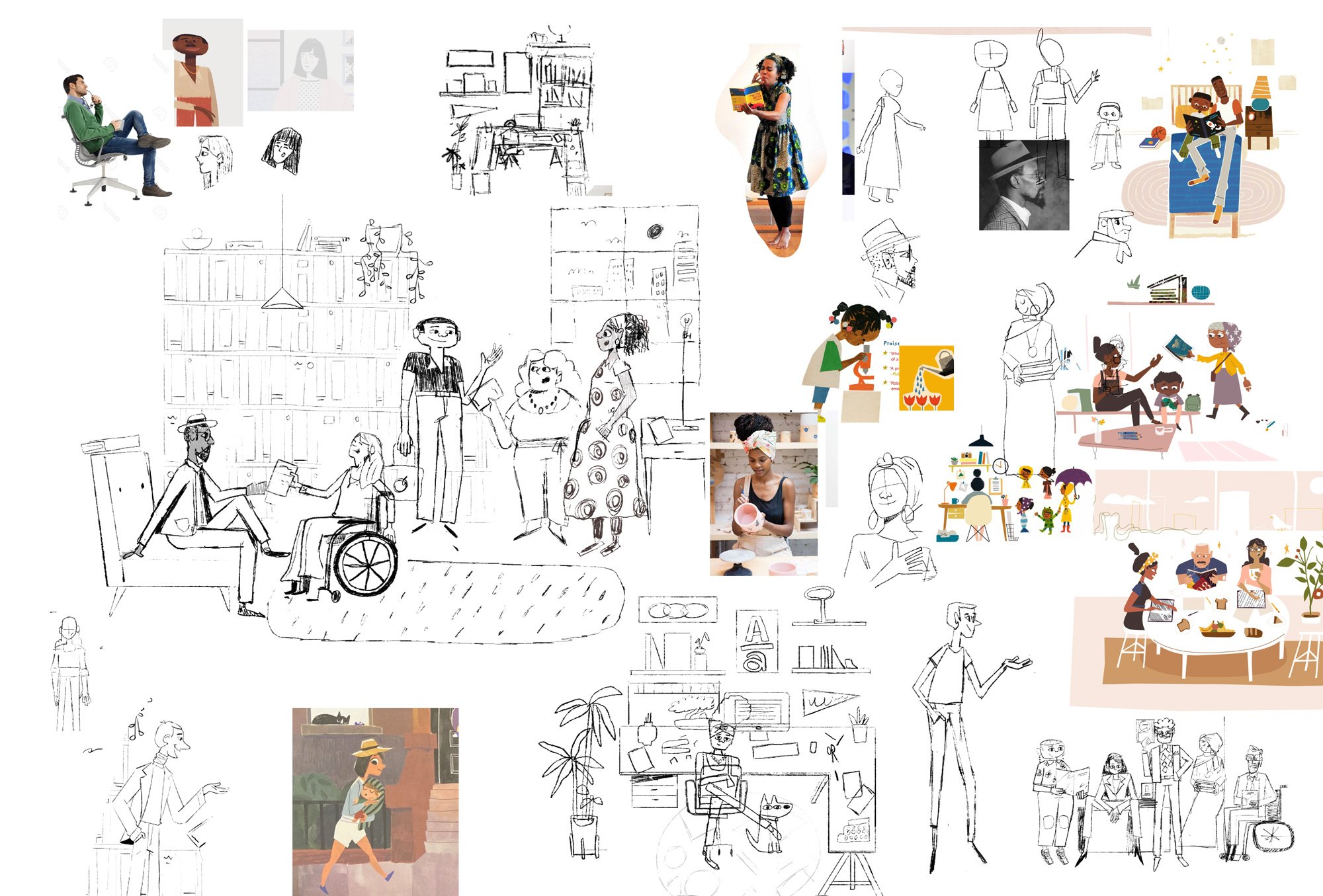
We built the style around three core pillars that act as a guiding light or north star. They are disruptive; seen in the harsh brushing and paper cuts, community; seen in the color palette and general kids book reference, and inspired; visualized through the interactions between the characters and sparks of magic and joy throughout.
I wanted to create a set of illustrations that complimented that alternative approach with harsh angles and textures while also demonstrating the community driven love that goes into the recommendations, and pay homage to classic book covers and the inspiration the stories hold.
Visual Library
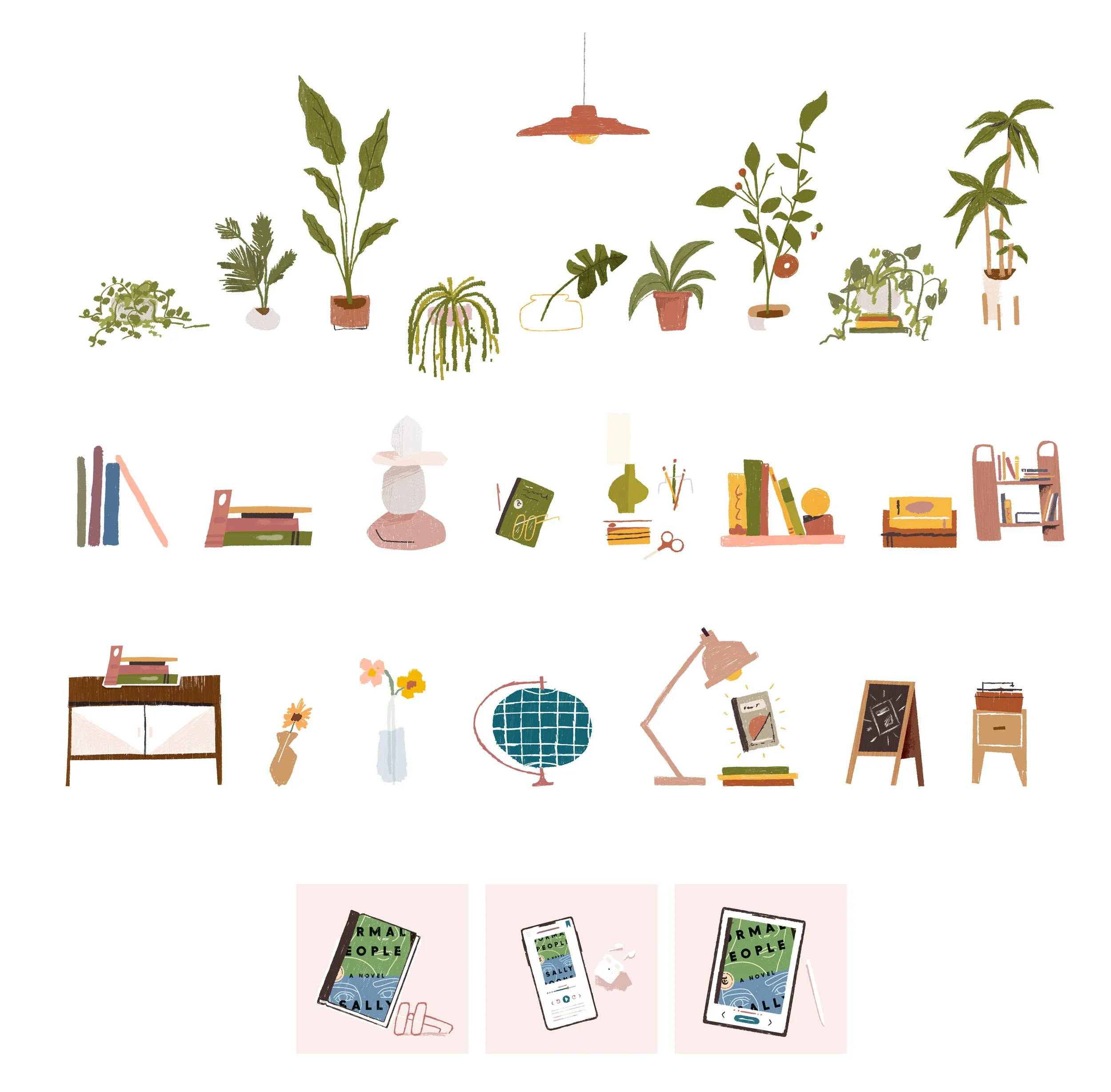
We created a flexible and diverse set of illustrations to be used and reused throughout both the marketing site and product. It was important to have a modular system that allowed us to pull apart and break down the illustrations for various applications.
Below are some of the assets pulled out of the larger illustrations to create a modular library.
Generated Imagery
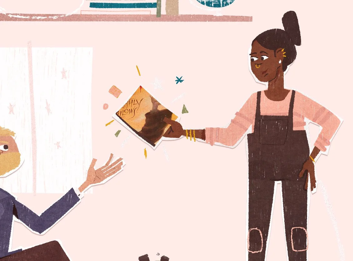
We used some fun CSS masking and automation to feature book covers based on the users interests through our illustrations. These book covers are clickable and will direct the user to the book's purchasing page and can be generated on the fly based their preferences and previous interests.


Responsive Design
Additionally we built the illustrations with responsive (mobile first) designs in mind. Being able to serve small, medium, and large illustrations based on the screen size and device (mobile, tablet, desktop, etc) made sure the characters and interactions always take precedence over the background.

Process & Sketches
Got a Project?
