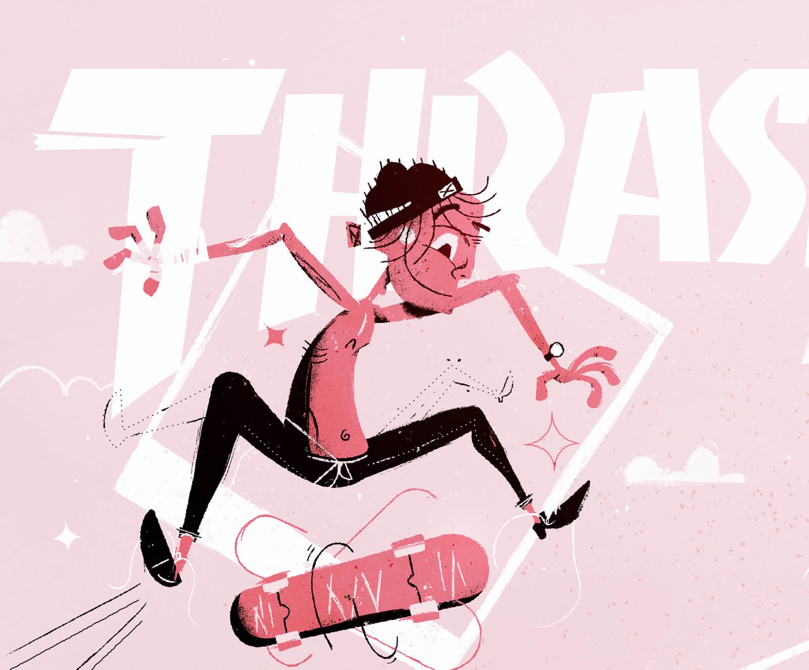
Thrasher Reaction
An assignment for my MFA in illustration. The task was to take inspiration from an era and apply it to a modern product. For me, using the work of Jim Flora and applying it to Thrasher Skateboard Magazine.
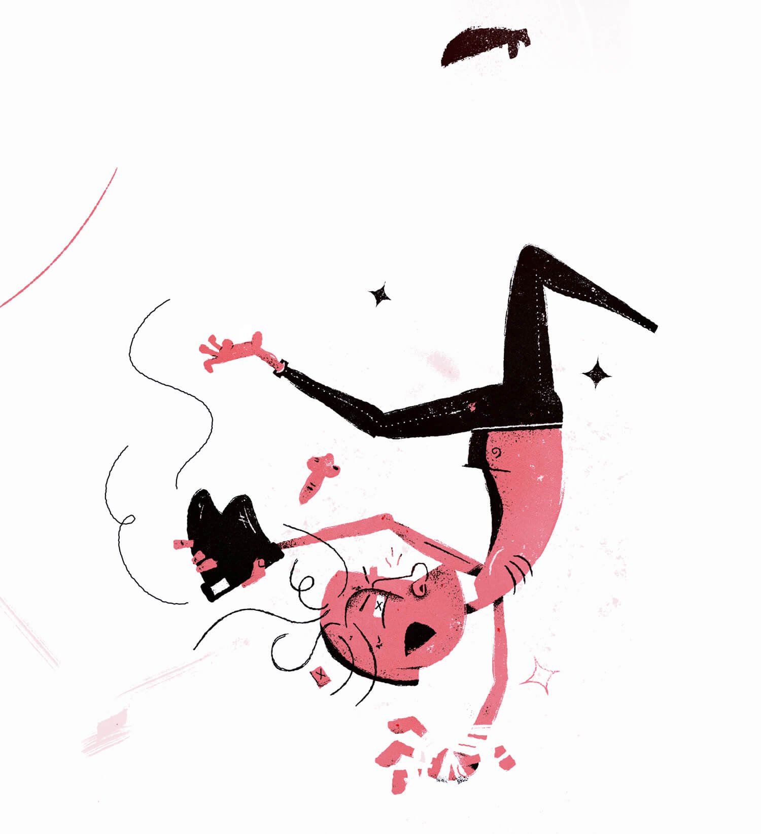
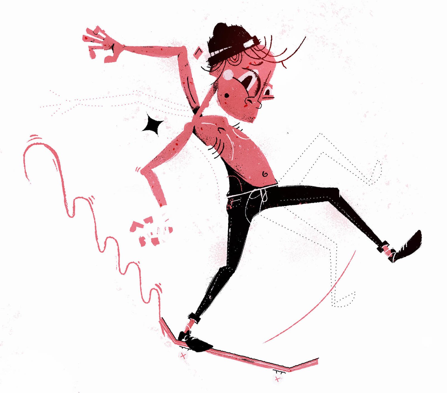
Mr. Flora's work is often chaotic and tends to have little in the way of conventional hierarchy (size, shape, color contrast) but instead uses a guidance through shape and line to tell a story. He moves the eye across the page in whichever direction he wants the viewer to see. I used these tactics starting up and left moving down the rail. The shoe and skateboard popping off at the end creates a circular motion back up toward the logomark and back to the top left skateboarder again to create a loop. The photographer, holding a secondary color palette, is meant to be seen as an extra.